
Looking very much like a Hardy Boys or Nancy Drew mystery from my childhood here in the United States, the late 1950s/early 1960s edition of the third book in the schoolboy trilogy of George Mills is likely the most colouristically most eye-catching and appealing of all his books, as far as children might be concerned. Perhaps even to grown-ups as well, being the ones who presumably allowed or disallowed the purchase.
Here we have a text, printed in Czechoslovakia by Spring Books, London, in which, as we know by now, there is no copyright date. There is also no illustrator named, and for the first time among the books of Mills, there is not even a signature or set of initials woven into any of the works of art.
 Following a format similar to all of his post-WWII books, the book has a full colour dust jacket and frontispiece, as well as four black and white plates inside.
The execution of the painting is energetic and makes use of a rainbow of saturated hues to create the cover illustration. It's attractive, and quite appealing in a nostalgic way that I'm not sure it would have evoked at the time it was created.
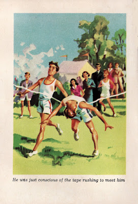
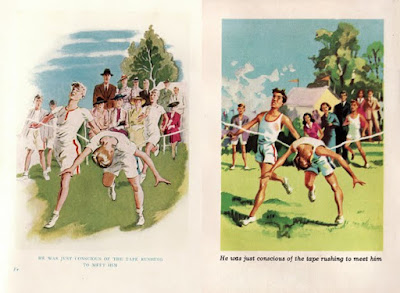
The frontispiece is a knock-off (or should I more politely say, an "appropriation") of John Harris's frontispiece from the 1939 first edition. Harris's was actually too delicate, unwisely using colours that were too high-key and pastel-y, to give a real feel of that doggedly gritty race at a boys' school. It was not the particular artwork in that edition he should have focused on stealing.
This anonymous paean to that less than noteworthy painting certainly saturates the colours more, and our anonymous artist handles the paint more expressively. However, one can almost see within the image the small, desktop wooden mannequin used by artists to pose human figures at the drawing table in lieu of an actual model. Those clunky wooden figures can be arranged in some awkward poses that the human form won't comfortably do, and we see two of those in this awkward painting.
You can see a comparison of the 1939 watercolour with an indistinctg and ineffective vignette edge and the 1950s-ish gouache duplicate with crisply masked edges. [Click any image to enlarge it in a new window.]
The pen and ink drawings on the inside plates [below] are nothing to write home about to say the least. They are 'children's-book-illustration-mediocre,' which is a step or two down from 'grown-up-book-illustration-mediocre'—clearly the weakest works of art in any of Mills's texts, first editions or reprints.

"'All right, it's only me'" [Page 55]

"'What on earth are you doing, Fleming?'" [Page 99]

"His diary was not there!" [Page 165]
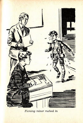
"Fleming Minor rushed in" [Page 215]
That last plate contains an image of a soaking wet boy, Fleming Minor, who is running—and a mirror image theft (uh... "appropriation") of the embellishment John Harris added to the Table of Contents page in the first edition of Minor and Major. The figure is completed by the 1930s-style uniform he is wearing, exactly like the one in the 1939 version. (To see Harris's original figure, click HERE.)
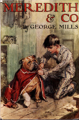
One can almost see, by the relentless downgrading of the quality of the illustrations, the esteem in which the writing of Mills was held. From beginning with the legendary cross-genre illustrator C. E. Brock [his cover for Mills's 1933 novel, Meredith and Co., is seen below, left], Mills ended up with illustrators that were just average—in the field of children's literature—and below average overall.
 Of course, fine children's book illustration was changing at that time, and I can't see the work of Ronald Searle, for instance, working well in one of Mills's books, despite Searle's brilliance. It simply wouldn't be a good "fit."
And with that we close the final gallery of art relating to the literary works of George Mills—that is, unless a copy of 1939's Saint Thomas of Canterbury goes on sale somewhere in the world, or I can get access to some scans or photocopies of the 57 page text from one of the few libraries still carrying it on their shelves.
That would complete our artistic journey! But until then, this is the last of it.
Mills would have realized, after receiving advance copies of this reprinted edition of Minor and Major, that what he held in his hand then would, indeed have been "the last of it" for him.
One wonders what seeing that dust jacket above, and flipping through these final illustrations, meant to him. From this point in his life, until his death in 1972, Mills lived in Budleigh Salterton with his spinster sisters, Agnes and Violet Mills. He would never publish another book.
Beyond the fact that he was sociable, no one there seems to have known much about him. Not a single person seems to have known that he was a children's book author. No one really remembers George at all.
One wonders why.


![Meredith and Co. [1933] by George Mills](https://blogger.googleusercontent.com/img/b/R29vZ2xl/AVvXsEjlUeRNPnH8Xd8JT59QdtabQHRI6DI6Hqew57i6qixjOL3LjgUD9g22o3-wNlmBya36D5-6KZXX-sxLnktAfEqjlvTmdwyiIL2K6VHOGW2Wq9Pe8_oFGknENfVE1Xrkdj0b8FYXTz_6SMg/s1600-r/sm_meredith_1933.JPG)
![King Willow [1938] by George Mills](https://blogger.googleusercontent.com/img/b/R29vZ2xl/AVvXsEgiz_iaQjinIbVw6yQ-W4hwx6wGJwMQH9azCs3Qacp9eX627B7Eq9hMn1wlHLzlkbcflHRWM8VcPX-1uteKbs4LA5q5Oq69WhrnhzBQLjpseK_M34PSoOOhTZ96EfVAGFehG53gZ0M4EvU/s1600-r/sm_1938.JPG)
![Minor and Major [1939] by George Mills](https://blogger.googleusercontent.com/img/b/R29vZ2xl/AVvXsEgH5nj4Q6BNpzVEb1vyJeGV6ikuN4SFAyDa-jypIgbvdrxqcjHkNxqjrXH7ptZmge7oTTpn5QjAI0yCJPdI-fIzooCDD1TAA3RDxO9jzLcU3QOIhBWKiKNz6CPjCSTZgIPd9_4zM7LLpAw/s1600-r/sm_1939.JPG)
![Meredith and Co. [1950] by George Mills](https://blogger.googleusercontent.com/img/b/R29vZ2xl/AVvXsEgm_JPAXPpX0wb8bDkjYG67Sg1HePiPhRP6b9oUMWvkJhiW6XJzmxTQ7TBepfxpPgRrFNCRuumYRj-SAfU9Kw-uDsbO5HBtyxfQfClHVMJxJUkDpbkrCPhzpC4H_g_ctlirgnSla4vX1EQ/s1600-r/sm_1950.JPG)
![Meredith and Co. [1957?] by George Mills](https://blogger.googleusercontent.com/img/b/R29vZ2xl/AVvXsEg0zRm3-CCmA8r2RrBmrACDvmxJjoBjfxUoPI9yc6NWu1BZ3dd89ZvCixmmKZe1ma0QiDIrsDZNqf-8h1egh0JLiRYHagXAqQ1UknWPy6SksK76psYPcEMLGa_Aj7wo2vMFPo0aMdcx_pg/s1600-r/sm_meredith.JPG)


No comments:
Post a Comment